
Enabling more meaningful connections on Feeld
Mobile App • Re-design • User Testing • Prototyping
Introduction
Feeld is a dating app that has grown quickly in the past year due to its introduction to the US market. Built on an outdated tech stack that didn’t allow for timely feature releases, new users became frustrated with the experience. Reaching over 1 million MAU's Feeld recognized the need to invest in both the product and the brand to stay competitive.
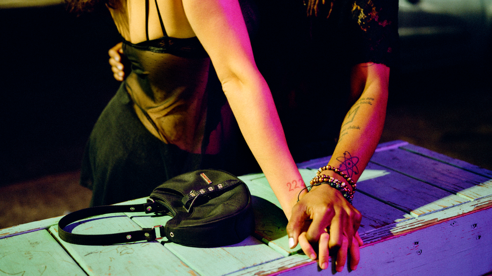
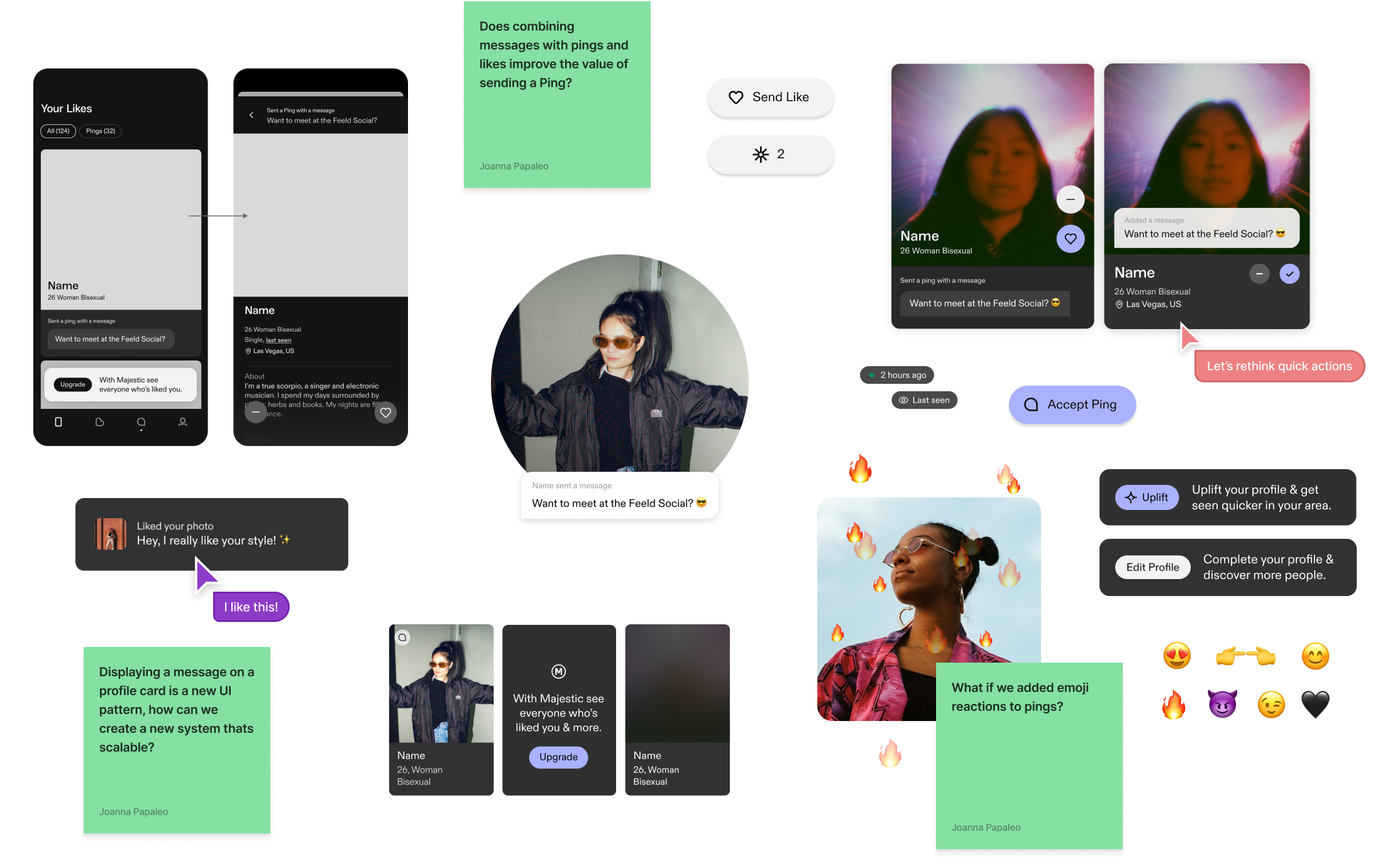
My team’s focus was to improve the discover and connection experience, increasing the rate of likes to meaningful connections* our first order of business was to re-design the Ping feature in the app, a highly requested improvement by both users and the business.
*meaningful connection = users connect and exchange a minimum of 6 messages.
Background
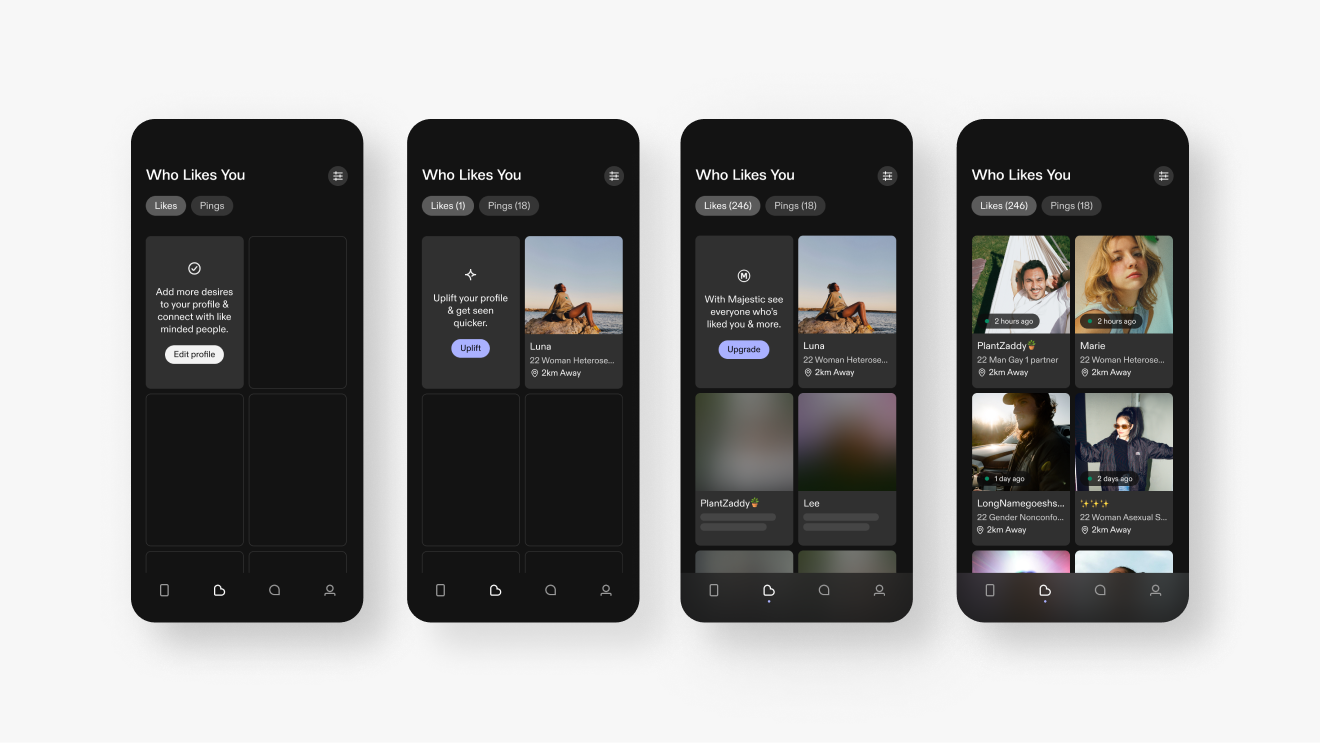
Pings are a premium feature on Feeld, functioning as a super-like. Their main advantage over regular likes is that they appear at the top of potential connections' lists. Currently, Pings are the only way to differentiate between types of likes and are the only likes visible to non-paying members.
- Connections made by sending a Ping are 1.5x more likely to be meaningful than those made by sending a Like
- Overall, 90% of Connections are made by sending a like while only 10% are due to a Ping
- Connections from sending a Like have a 30% chance of being meaningful, while connections via Pings have a 50% chance of being meaningful
- 1 in 4 pings are seen but not accepted
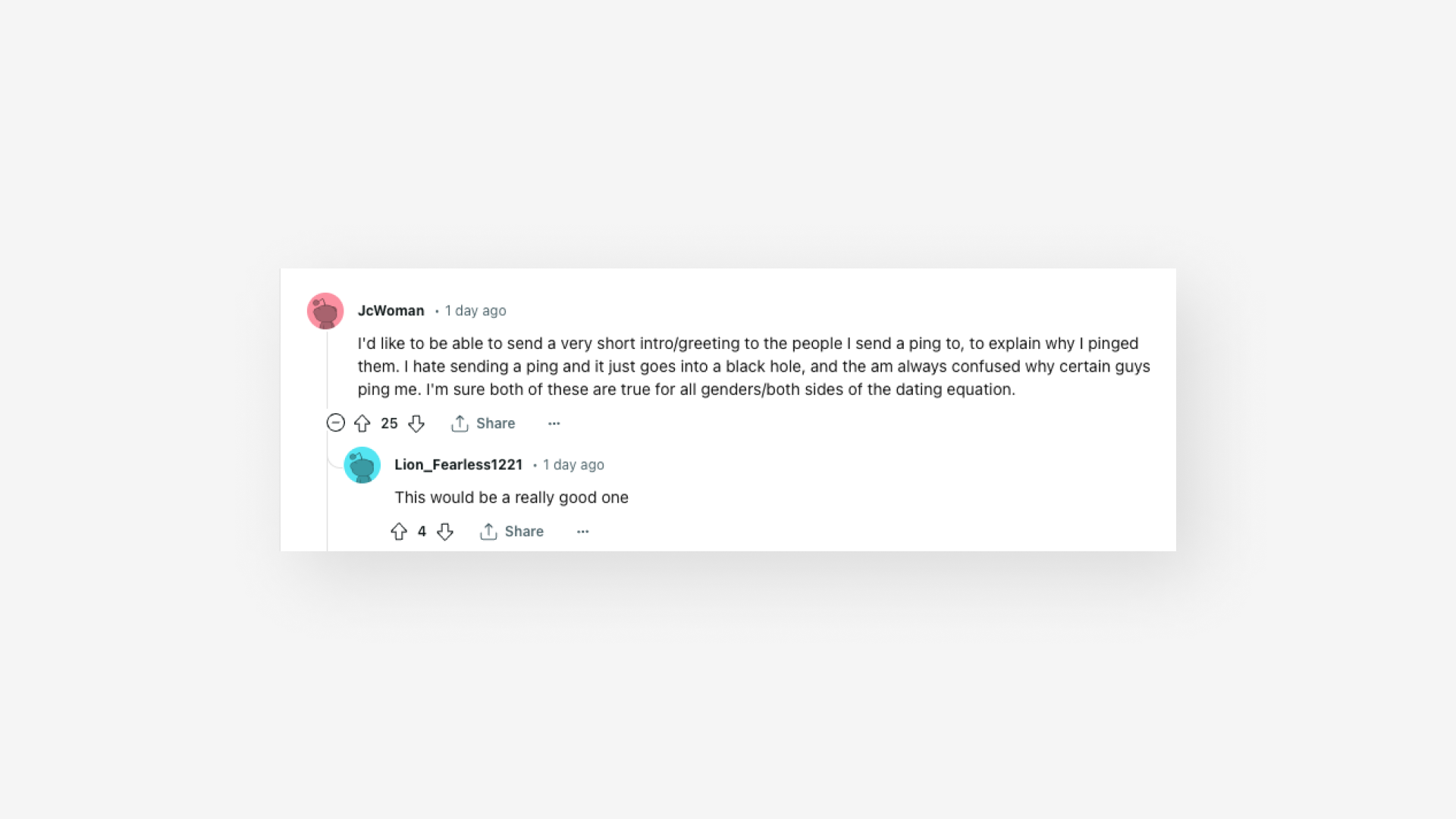
We know that Pings result in more meaningful connections but despite this, they have a relatively low acceptance rate. Our hypothesis was that if we could enhance the value proposition of Pings it would lead to an increase in meaningful connections and subsequently boost ping purchases. After considering several approaches, we decided to focus on adding a message to a Ping, improving the Pings UI, and providing the ability to filter likes.
The Brief
Enable users to express more than just interest by providing an option to add an opening line to their Ping. Consider the entire journey of the Ping message from sender to receiver, equipping users with the necessary tools to understand who likes them and establish connections more quickly.
Roles & Responsibilities
Lead product designer, user-testing & analysis, design systems, documentation, stakeholder presentations
Constraints
Limited development resources, globally distributed team, shifting priorities
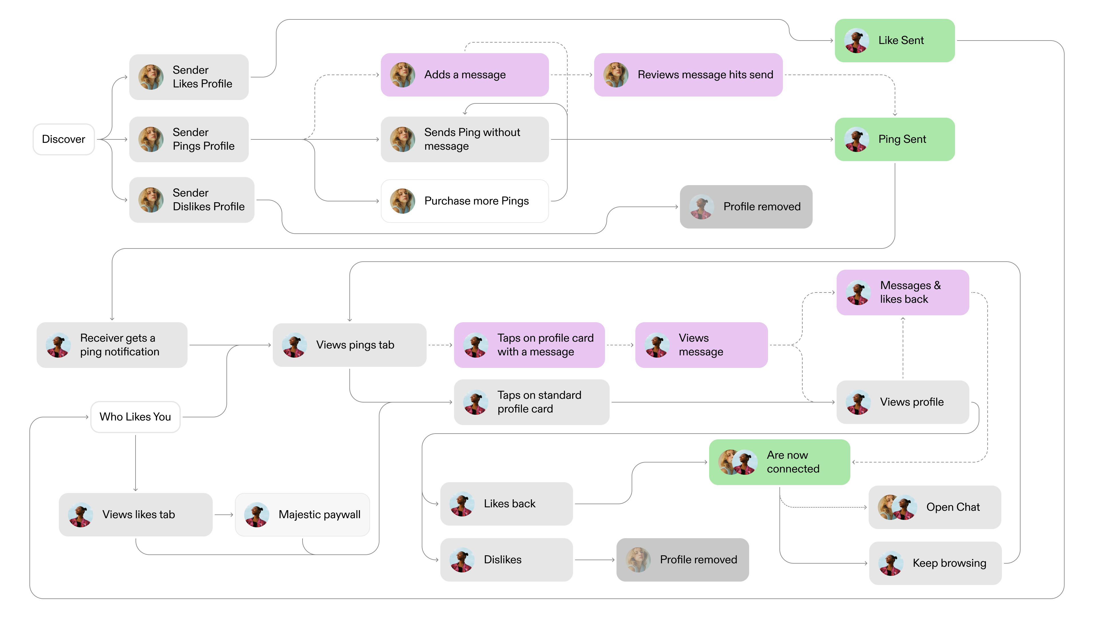
User Journeys, with new flows for messages added
Challenges
The previous design used outdated UI paradigms from the old tech stack which had significant usability issues. It also lacked the flexibility needed for the business to test and release new consumables. We also needed to incorporate new brand pillars into our decision-making process to ensure that the app offered a user experience that accurately reflected our brand strategy.
Process
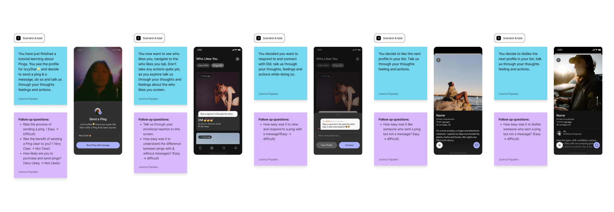
Although our ultimate goal was to arrive at an MVP solution, I explored with an expansive mindset, rooting decisions in brand strategy & data. I tested new ideas, interviewed cross-functional growth partners to understand business needs and audited competitors – studying messaging and commenting flows. While the feature initially seemed like a minor enhancement, I identified an opportunity to redesign the "who likes you" tab as a whole.
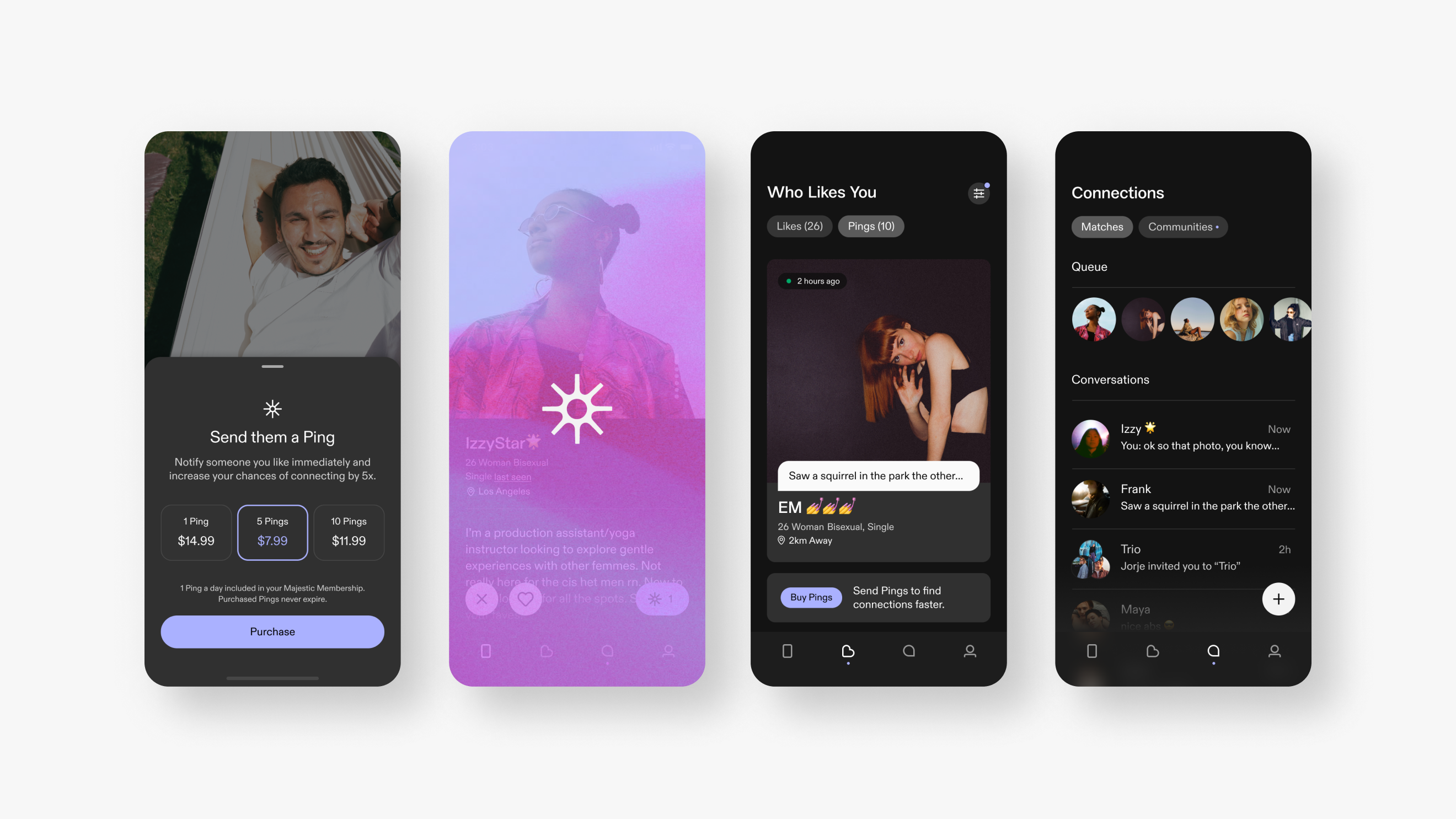
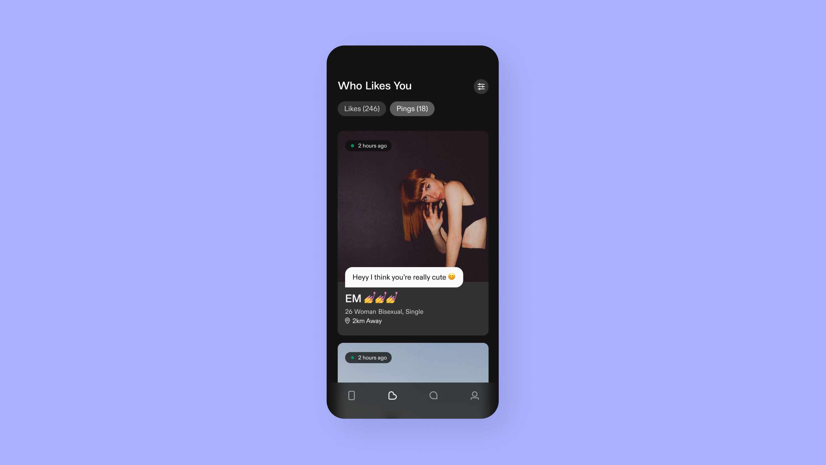
Enhanced sender flow
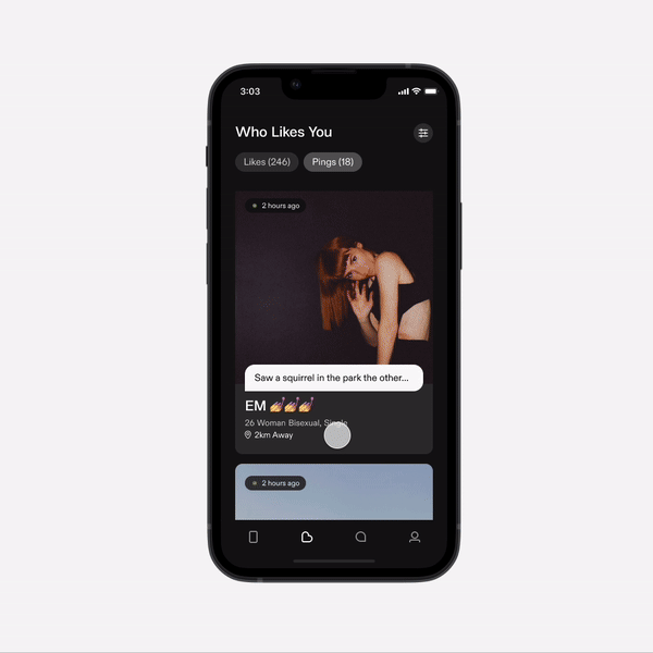
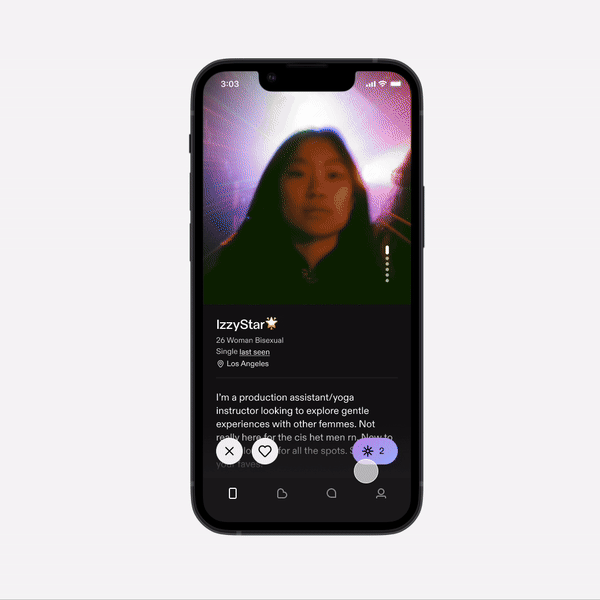
Redesigned Who likes you tab and new reciever flow
The Solution
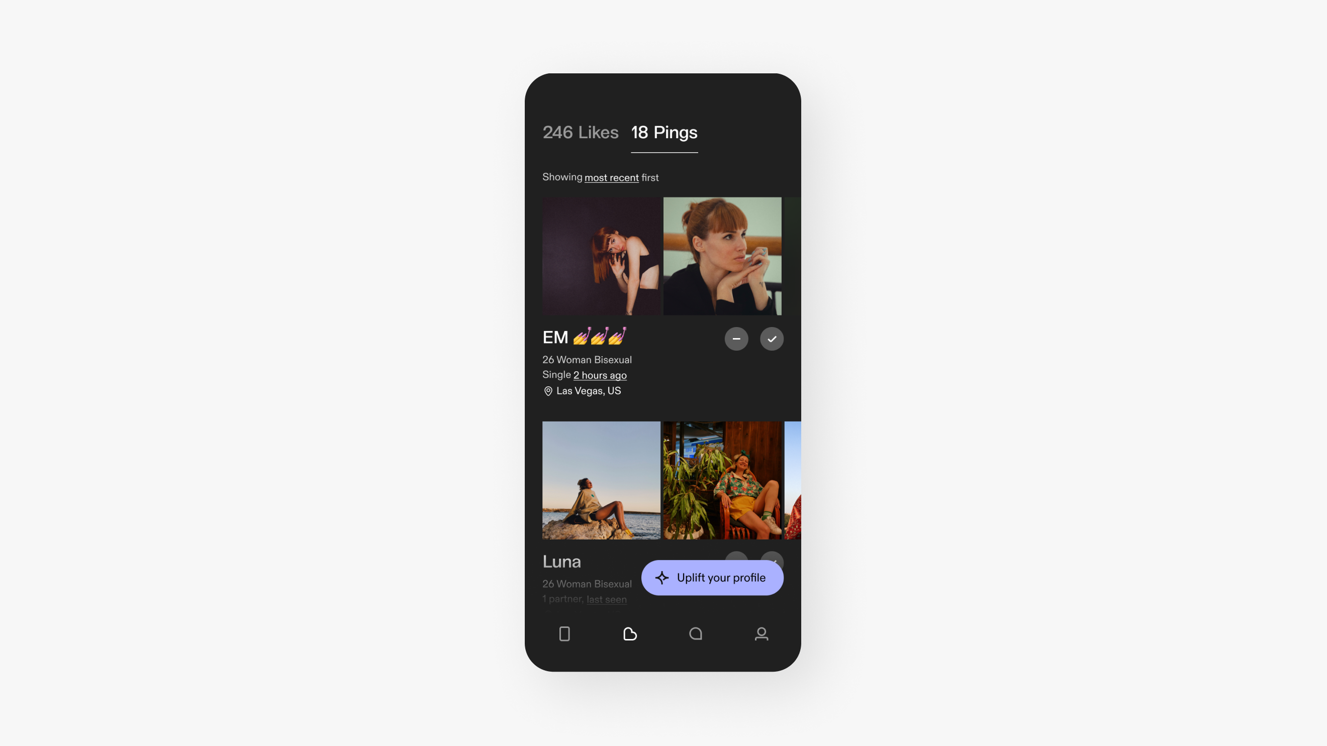
The result was easy-to-implement solution for senders by slightly evolving existing UI patterns and a new, flexible, and expandable card system for receivers. Additionally, I improved the acceptance & flow to create a better experience across both pings and likes. I also finalized filtering work that had been completed by a previous workstream, by updating the logic to work within the redesigned WLY experience.
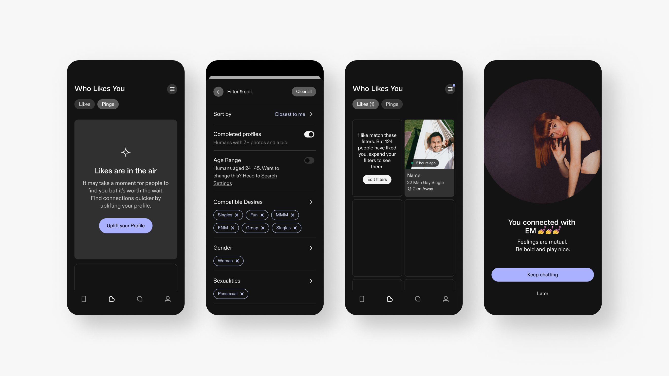
Empty state, filtering & connection screen
Building on previous work I did with the membership team to improve the Majestic upsell screen & the IAP on 'Who Likes You' tab (one of our highest converters), I collaborated with my growth partner to understand the business needs for pushing out and testing different consumables. Our solution was a flexible card that adjusts according to a user's journey. This makes in-app purchases feel more relevant and helpful, as opposed to a consistent call-to-action that prompts the same action repeatedly.
Like cards and states
Testing
After completing the designs, I conducted an unmoderated testing session with eight participants, all experienced with dating apps. The group included both users who have previously paid for apps or made in app purchases and those who have not. I prepared the test script and set up the prototype in Figma before initiating the test on usertesting.com.
The goal was to understand if participants grasped the value of pings over standard likes and how likely they would be to purchase and send pings. We also had them navigate through several scenarios on the 'who likes you' tab to evaluate the intuitiveness of the flows.
Testing plan
"The whole thing was very, very straightforward, easy to engage with. I would make the dislike function just a little bit clearer, maybe an X rather than just a dash would be a lot more obvious. But I'm nitpicking at this stage."
45 Male, UK
Overall, the test did not reveal any significant usability issues, and the general sentiment was positive. The only friction we saw were users feeling unclear about the dislike icon on the profile screen, the team agreed this could be clearer and I swapped the minus icon to an X.
Pings tab before / after
Conclusion
After testing I presented the designs and user testing insights to our CPO and CEO, both signed off on the feature and gave us the green light to start development. One significant challenge was that our small development team was scoped on other work, causing the design team to move ahead independently. So we leveraged our understanding of their workflow and the chat API to guide our explorations. New and improved Pings & Who Likes You is in the pipeline, but due to shifting business priorities it’s been deprioritized for now.
© Joanna Papaleo 2025